Problem
Festival visitors want to know what happens when, who is performing, where the venue is and how to get tickets. When that information is spread across posters and posts, people miss sessions or give up on going.
Goal
Put the schedule, lineup, venue and tickets in one place that is easy to check on a phone.
Plan
- Option: social media announcements only. Decided against it: the schedule gets lost between posts.
- Option: a downloadable programme. Decided against it: awkward to read on a phone and hard to update.
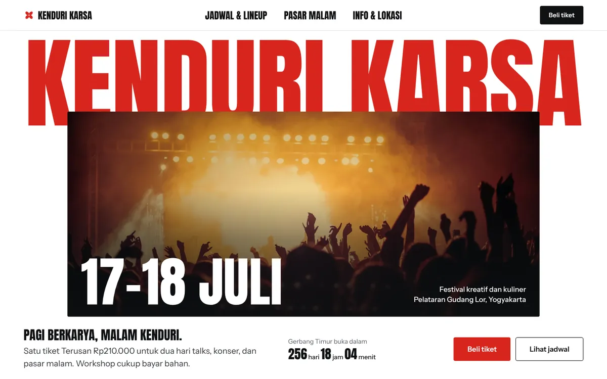
- Decision: a site with a day-by-day schedule, lineup pages, venue information and a clear ticket button.
Build process
- Research & structure: Listed the questions festival visitors ask first and turned them into a page map and copy.
- Design: Gave the site a lively, festive look while keeping the schedule easy to read.
- Build: Built the pages mobile-first with light, optimised images so they load quickly on a phone connection.
- Review: Checked every page across phone, tablet and desktop sizes and tightened copy that was hard to scan.
Final product
- A day-by-day schedule.
- Lineup and speaker pages.
- Venue information with directions.
- A ticket call to action visible throughout the site.
Lessons
- For events, the schedule is the most visited page and deserves the most care.
- Keeping the ticket button always visible helps people act when they decide.
- A festive look must never get in the way of practical information.