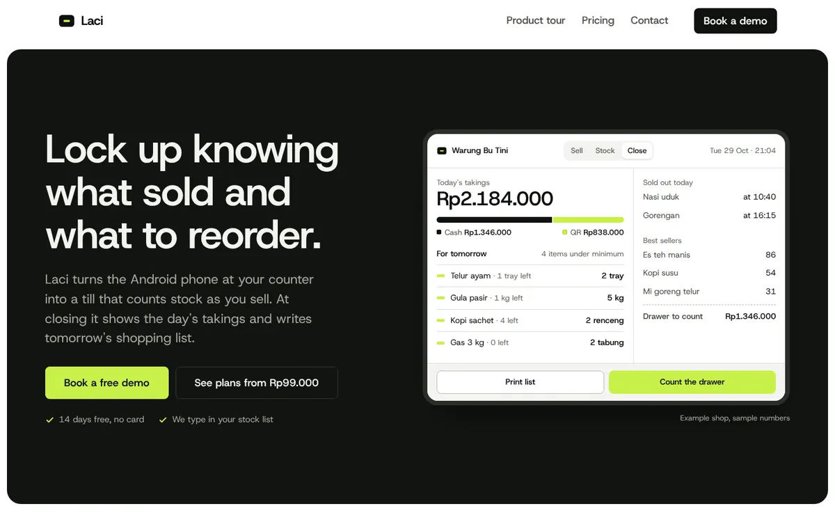
Problem
People evaluating a software product want to understand what it does, whether it fits their needs and what it costs, often within a minute. Vague headlines and hidden pricing make them leave.
Goal
Explain the product clearly and guide visitors towards signing up.
Plan
- Option: a single sign-up page. Decided against it: visitors need to understand the product first.
- Option: a long feature list. Decided against it: too much to read before the value is clear.
- Decision: a clear headline, focused feature sections, an open pricing comparison and a sign-up button.
Build process
- Research & structure: Listed the questions people evaluating the product ask first and turned them into a page map and copy.
- Design: Chose a clean, modern look with simple illustrations of what the product does.
- Build: Built the pages mobile-first with light, optimised images so they load quickly on a phone connection.
- Review: Checked every page across phone, tablet and desktop sizes and tightened copy that was hard to scan.
Final product
- A clear product headline.
- Feature sections that explain benefits in plain language.
- A pricing layout that compares plans side by side.
- A sign-up call to action at the right moments.
Lessons
- A clear headline does more work than any feature list.
- Open pricing builds trust with careful buyers.
- Comparing plans side by side helps people choose quickly.