Problem
Fashion shoppers buy on look and fit. They want to see how pieces are styled, find their size quickly and trust that it will fit. A plain product grid does not carry the feel of a label.
Goal
Let the label's style come through while keeping choosing a size and variant simple.
Plan
- Option: a marketplace listing. Decided against it: no room for the label's editorial look.
- Option: a lookbook-only site. Decided against it: shoppers cannot pick sizes or buy.
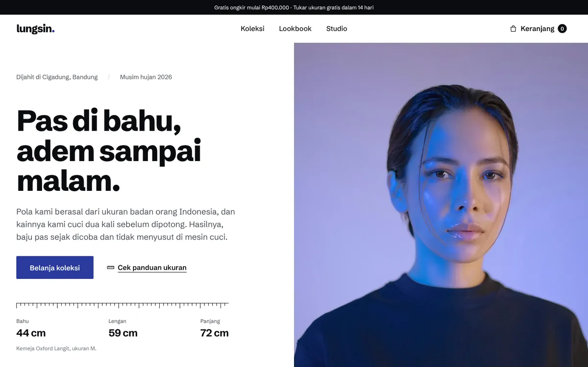
- Decision: collection pages with editorial imagery, a seasonal lookbook and clear size and variant selection.
Build process
- Research & structure: Listed the questions fashion shoppers ask first and turned them into a page map and copy.
- Design: Designed an editorial look around the photography, with product details kept close to each image.
- Build: Built the pages mobile-first with light, optimised images so they load quickly on a phone connection.
- Review: Checked every page across phone, tablet and desktop sizes and tightened copy that was hard to scan.
Final product
- Collection pages with editorial imagery.
- A lookbook for seasonal releases.
- Clear size and variant selection on every product.
- Image-heavy pages that still load quickly on a phone.
Lessons
- A clear first screen matters more than extra features.
- Good photography carries most of the visual work, so image handling must be right.
- Making size selection obvious removes a common reason to hesitate.