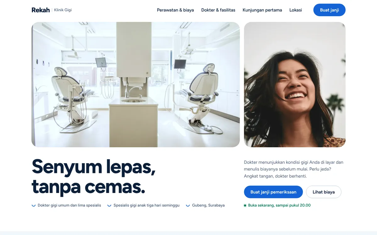
Problem
Patients who are nervous about a dental visit want to understand the treatment, know who will treat them and book without making a phone call. Clinic sites full of jargon make that harder.
Goal
Make the clinic feel approachable and make it easy to request an appointment.
Plan
- Option: a full online scheduling system. Decided against it: clinics usually need to confirm slots manually.
- Option: a single contact page. Decided against it: patients still do not know what to expect.
- Decision: plain-language treatment pages, doctor profiles and a short appointment request form.
Build process
- Research & structure: Listed the questions patients ask first and turned them into a page map and copy.
- Design: Chose a clear, reassuring look with plenty of white space and readable type.
- Build: Built the pages mobile-first with light, optimised images so they load quickly on a phone connection.
- Review: Checked every page across phone, tablet and desktop sizes and tightened copy that was hard to scan.
Final product
- Treatment pages written in everyday language.
- Doctor profiles so patients know who they will see.
- Branch details with location and opening times.
- An appointment request form that takes a minute to fill in.
Lessons
- In healthcare, plain language builds more trust than polished visuals.
- Showing the people behind the clinic reduces anxiety.
- A short form gets more requests than a long one.