Problem
People looking up a neighbourhood coffee shop are usually on their phone and want three things fast: is it open, where is it, and what is on the menu. Social media posts rarely answer all three in one place.
Goal
Answer "open, where, what" within the first screen, and give regulars a reason to feel connected to the place.
Plan
- Option: rely on social media only. Decided against it: hours and the menu get buried under posts.
- Option: a PDF menu. Decided against it: hard to read on a phone and easy to fall out of date.
- Decision: a small site with opening hours and the map near the top, and a menu that reads well on a phone.
Build process
- Research & structure: Listed the questions coffee shop visitors ask first and turned them into a page map and copy.
- Design: Chose warm colours and friendly type that match the feel of a neighbourhood café.
- Build: Built the pages mobile-first with light, optimised images so they load quickly on a phone connection.
- Review: Checked every page across phone, tablet and desktop sizes and tightened copy that was hard to scan.
Final product
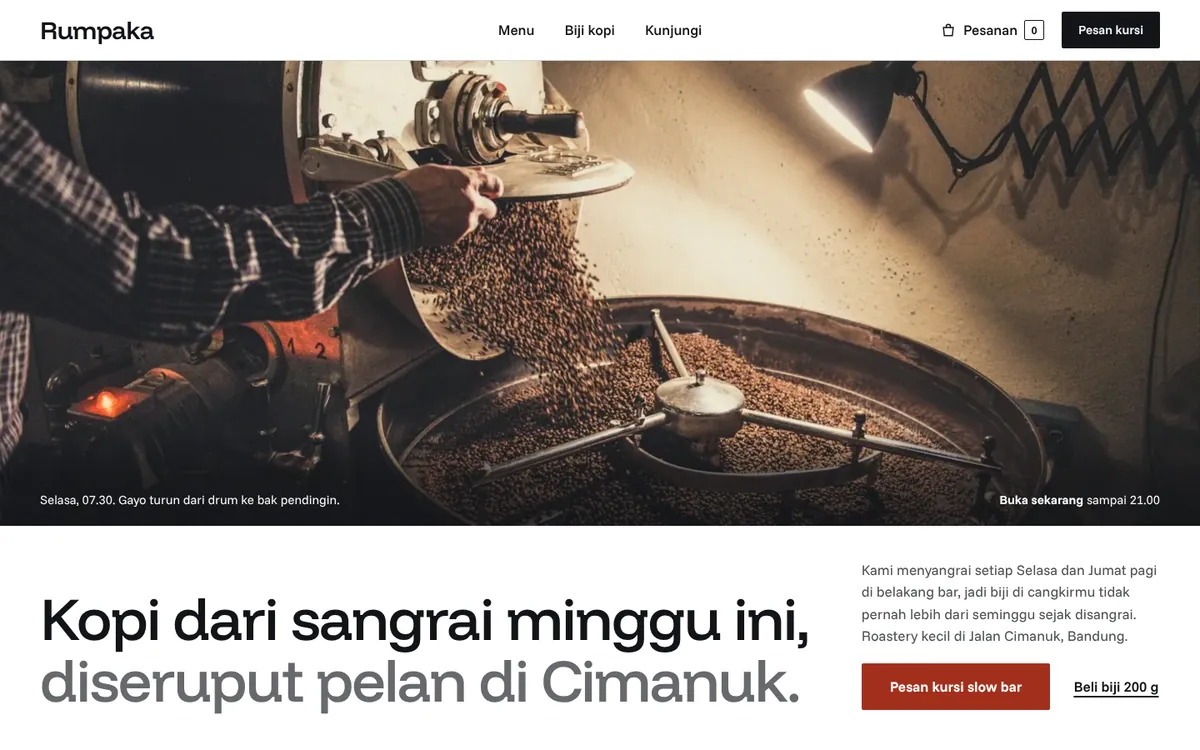
- Opening hours and a map placed near the top of the page.
- A menu grouped into drinks, food and beans.
- A story page about the people and the place.
- A layout designed for one-handed phone use.
Lessons
- For a local shop, practical details beat clever design.
- Grouping the menu the way people order makes it faster to read.
- A short story page helps a small place feel personal.