Problem
People looking for an architect judge a studio by its past work. They want to browse projects quickly, understand what each brief was and know how to get in touch. Heavy, slow portfolio sites make that tiring.
Goal
Present the studio's work clearly and turn interest into a first conversation.
Plan
- Option: a social media portfolio. Decided against it: no room to explain the brief and scope.
- Option: a long single page. Decided against it: hard to browse many projects.
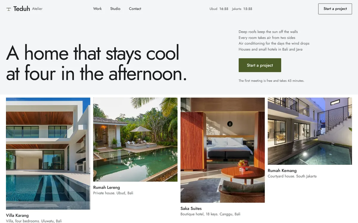
- Decision: an image-first project grid, a page per project with brief and scope, and a simple contact page.
Build process
- Research & structure: Listed the questions prospective clients ask first and turned them into a page map and copy.
- Design: Kept the design quiet and spacious so the architecture photography leads.
- Build: Built the pages mobile-first with light, optimised images so they load quickly on a phone connection.
- Review: Checked every page across phone, tablet and desktop sizes and tightened copy that was hard to scan.
Final product
- An image-first grid of projects.
- Project pages that explain the brief and scope.
- A studio profile that introduces the team and approach.
- A contact page with a short enquiry form.
Lessons
- For a portfolio, the design should step back and let the work speak.
- Explaining the brief helps visitors judge fit, not just taste.
- Large images need careful handling to keep pages fast.